
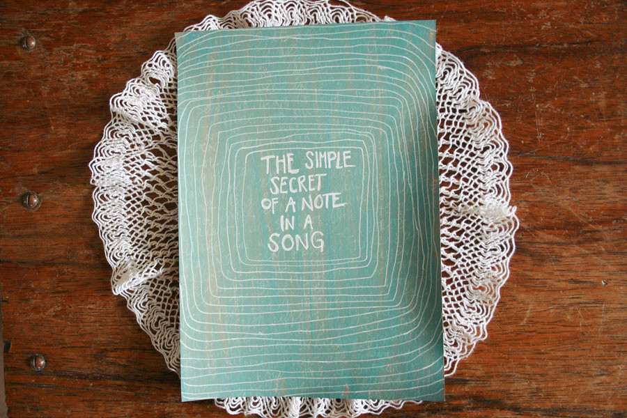
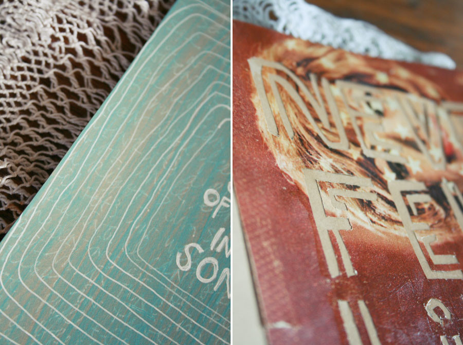
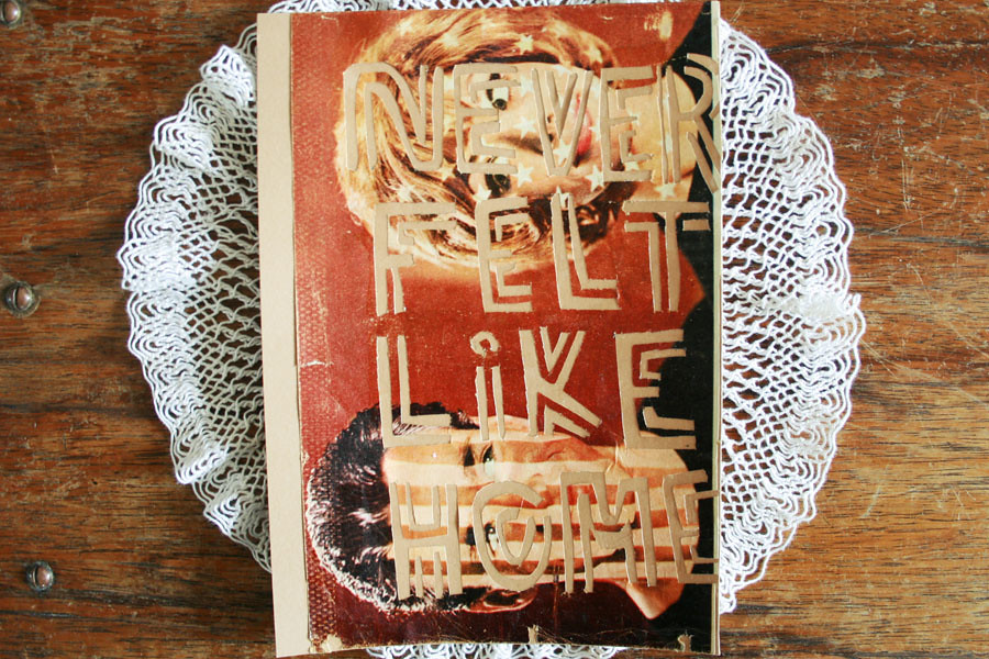
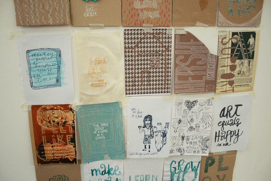
 Well, I still have some photos from then that I haven't shared. Here they are! The first one was 'Religion' and the 'never felt like home' is something about america.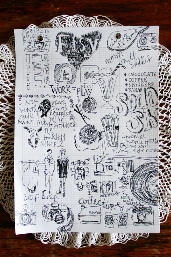
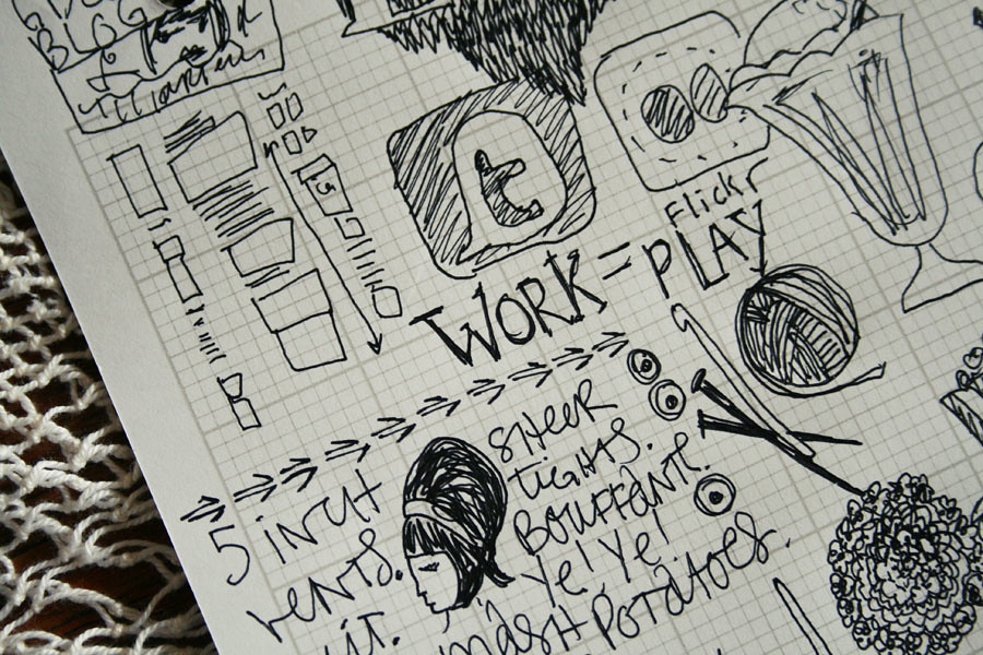
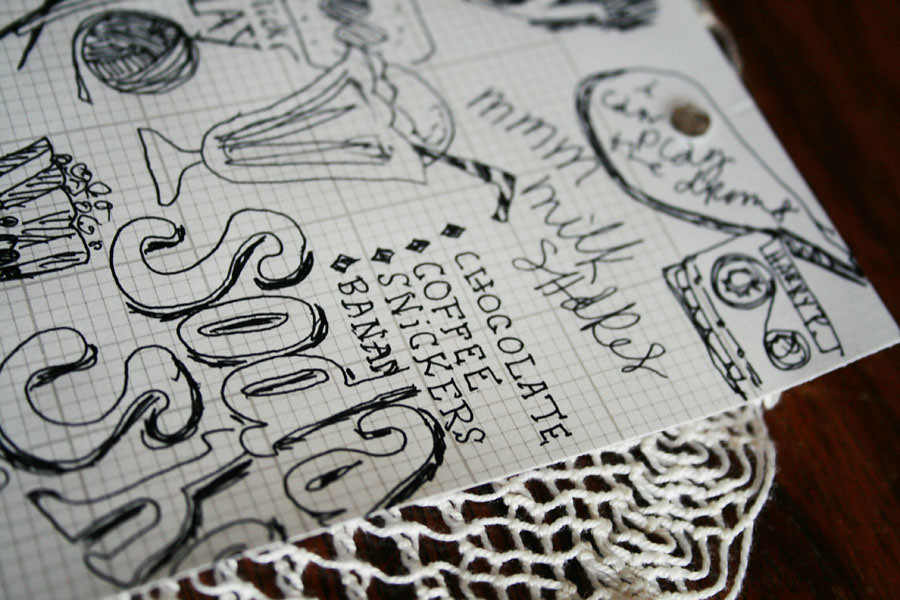 And this crazy doodle page is 'Hobbies'
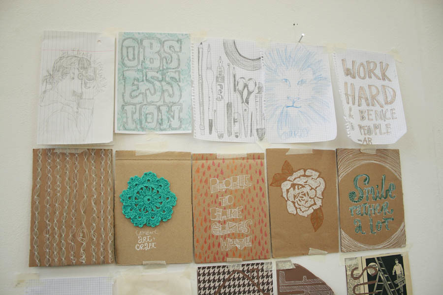
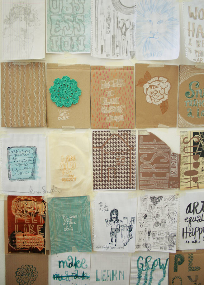 And to refresh your memory of what they all looked like together...
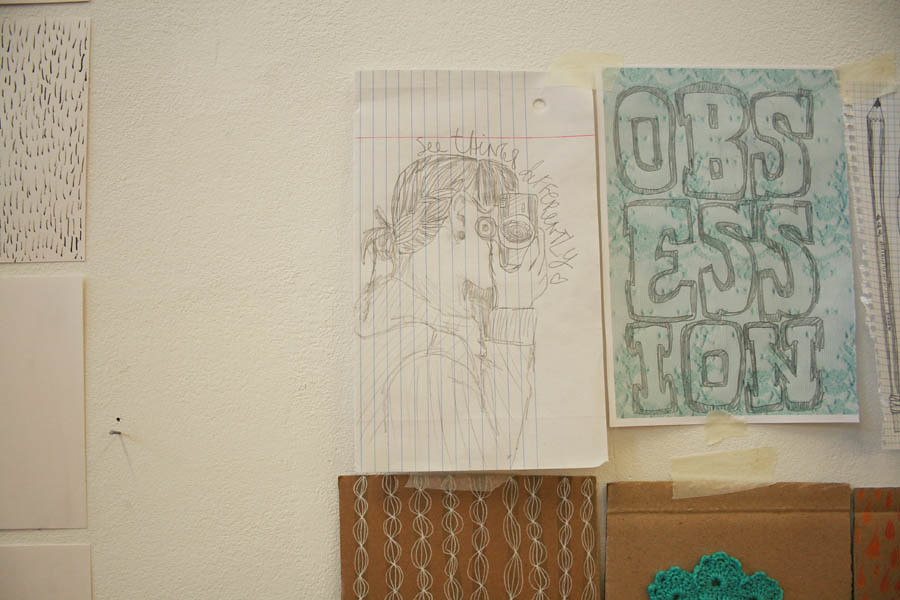
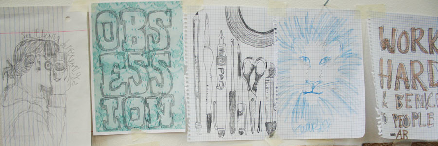 (Expectations: see things differently, have an obsession, be ready to try new things, have courage, work hard and be nice to people.)
 Possibly my favourite set of images I did was the 'Hopes' set. Here they are: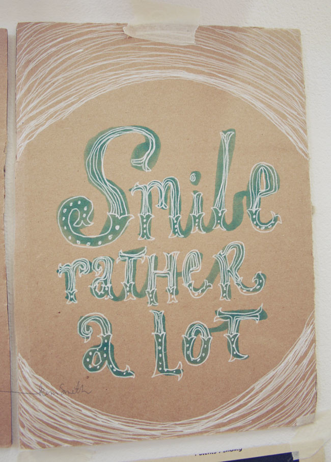
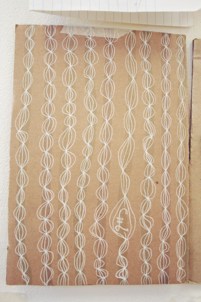 (this is more about finding the right thing that works for me that will make me successful- not that i want a lot of money. haha.)
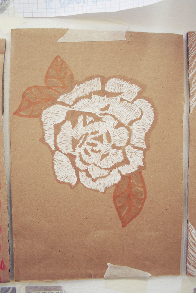 (this is one is about hoping that I can cope.)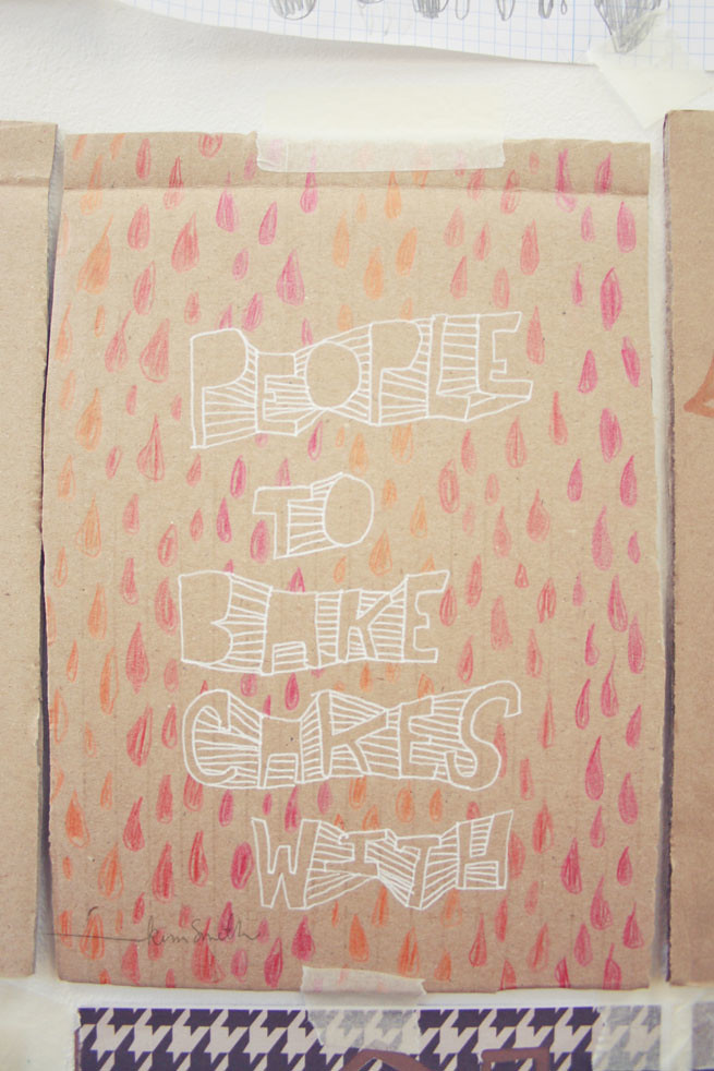
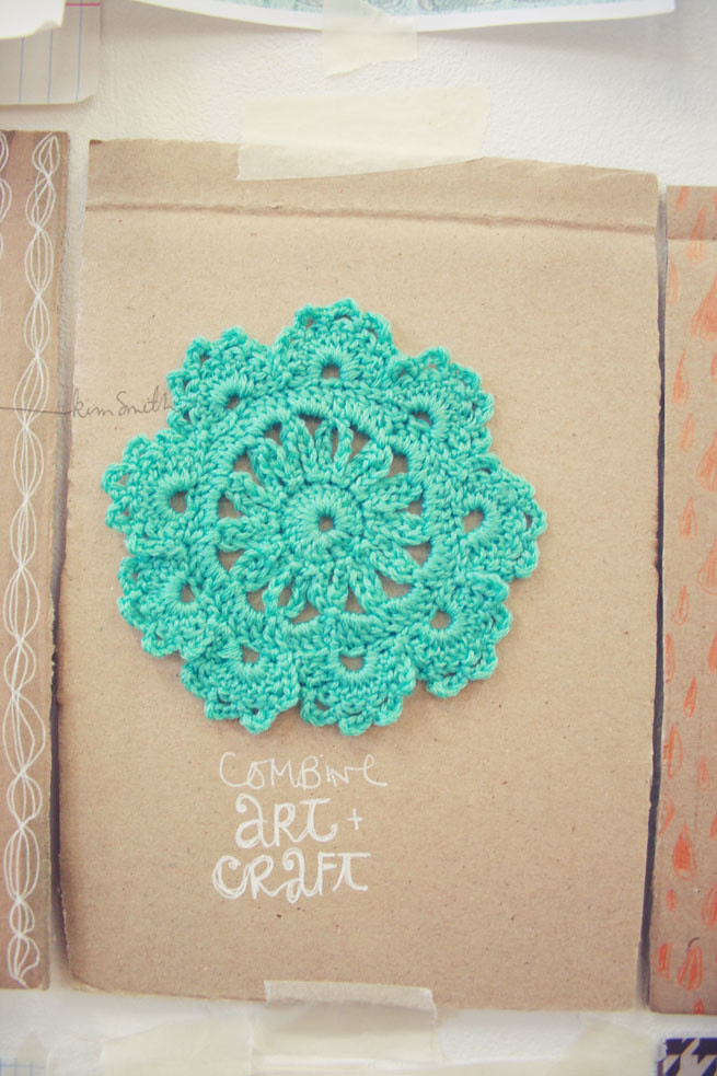 And lastly, I've neglected this 'hope' for the last term because I've been so focused on DRAWING. I think that's right. I think it was important for me to step back from trying really hard to do 'my thing' and just focus on how to draw! To be honest, learning to draw or at least learning how I draw was on the top of my list. It's probably my biggest insecurity. Everyone in our class seems to know what they are doing, they can just come up with things from their brain that looks amazing. I really struggle with this 'imagined' part of drawing. But I've noticed that after spending so much time this term focusing on specific tasks, that I've gotten (I wouldn't say 'better', maybe more in control) more comfortable with drawing from all different types of situations. It's really helped and I can see a huge difference- especially when I think back to this time last year- when I couldn't even draw a face. :]
So, I guess what I'm tring to say is that I'm excited about this new year, and hopefully incorporating my craft side into my work more obviously. I've been sneakily working on my knitting skills in the evening- but that's another post.

 Hello nice studio with high ceilings. Hello old friends and new friends. Hello Summer Project on the walls. Hello lots of really nice drawings. Hello masses of inductions. Hello nice words said. Hello nice talks from tutors. Hello new school year. Hello feeling awkward as always. Hello my work having more text than anyones (good or bad, discuss?). Hello Hello Hello.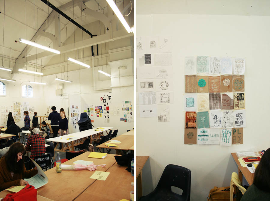
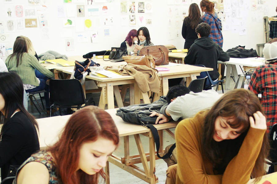
 Hello, my name is Kim- nice to meet you!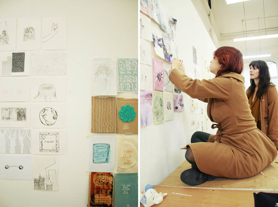
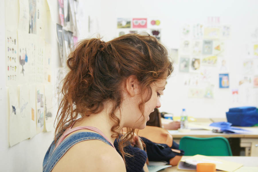 (Some sneaky pictures of the studio and some of my classmates.)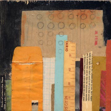
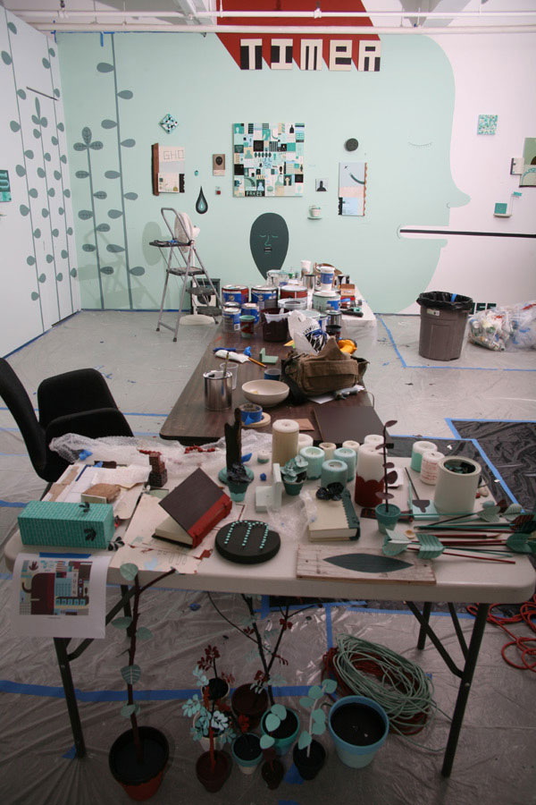 Behind all of that, the way he communicates things through very simple lines and words is interesting- even though it takes a little bit of interpretation to get the true meaning (like a lot of his work is about dealing with losing his wife but that's not obvious on first glance). I think he deals with emotions in a beautiful way.


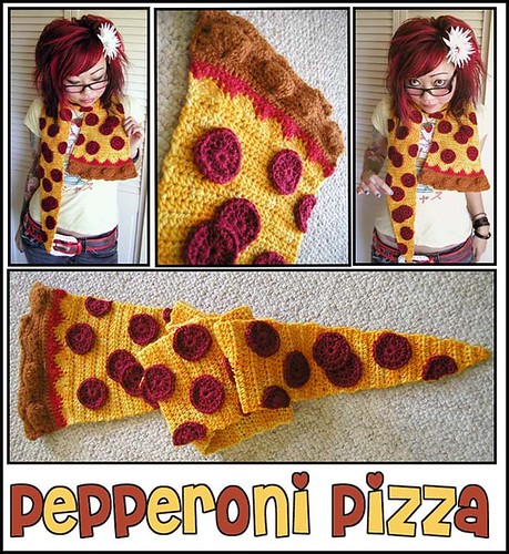
 objects, frills, craft, etsy shop. such beautiful photographs.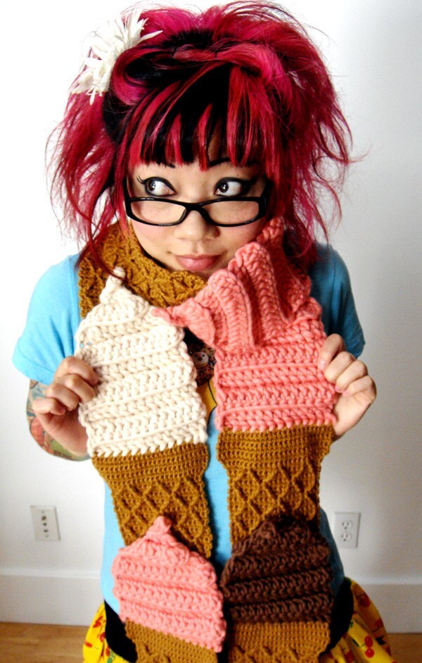
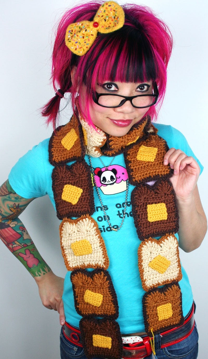


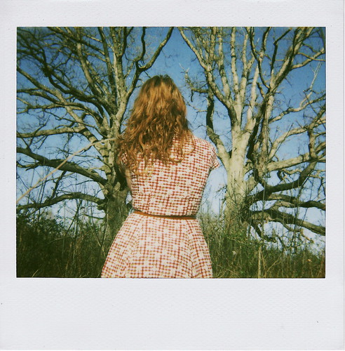 it may just be that i have a girl crush on Sydney, but I've followed her for a couple of years and she's always had interesting images floating around the internet. I like the carefree nature of all of them and how they really do feel like snapshots- often getting images that feel like stills from a film. Some of her videos are interesting too- This one is possibly my favourite:Other than the subject and feel of her photographs, they often have warm to neutral qualities about them that make them feel more accessible. She might laugh when I say this- but also I think they tell a story about growing up and finding freedom and what you might do with that new found control (or lack of).
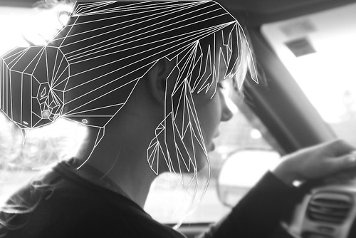 I'm interested to see what she does with her talents.
 First of all, i'm not a huge fan of the colours. there is something a bit sickly about them- maybe if they weren't mixed or mixed with brown or something they wouldn't feel so... gross? I don't know- but beyond that, I like the sentiment and the layout and the handwriting and it reminds me so much of Sabrina Ward Harrison (I found Erin on flickr while looking for inspiration on Art Journals). Art Journals in general really interest me- a place to store confessions and secrets and spill out your heart a little bit while being creative. It's a form of therepy and I think that part of it trumps whatever colours are used. If this was my page, I would feel like it needed more- but that's why I like it, cause it's brave.
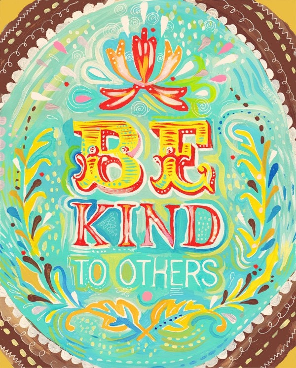 Interesting colours, interesting typography, interesting painting, wonderful messages.
 http://www.etsy.com/shop/thewheatfield