
Showing posts with label assignment. Show all posts
Showing posts with label assignment. Show all posts
Sunday, 1 April 2012
Tuesday, 7 February 2012
Fact + Fiction. Studio. Exhibition,
I was going to post this on artequalshappy but it got wordy and long. putting it here as a document.
Hello! It's been assessment time around the Camberwell Illustration department. 1st years had thiers, we just finished ours and the 3rd years were looking pretty stressed today labeling all thier work. It's customary for the 2nd years to put on a little show around this time, celebrating the work we've all be doing over the last Unit.
We've done three main projects called, Fact, Fiction and Publish where our main goal has been to really progress in our personal development. As you can probably guess, one of the projects is based on something factual, and another something fictional and the third is all about ways and means of publishing the work. Basicaly. Kind of.
There is a huge range of work up- and it was definately a challenge organising and sorting all the work so that the exhibition flows nicely. We put together a nice (small!) team of self-motiviated individuals to sort out the hanging on the show, and I've been heavily involved in it (obviously not standing on ladders. I'm dreadful with balance these days). The kind of opportunity to get together and be incredibly pedantic about placement and spacing is pretty rare & although you can't always please everyone- I think we did a great job for our first crack at it.
It's so good to have done this because that means that we will be just that much more prepared for our Final Show this year AND our 3rd Year Show! I can see good things ahead, people!!!
It's also been amazing to see my knitted pieces up alongside all the drawings and paintings and prints. Kind of put tears in my eyes. Ok. Maybe it didn't. But because I was trying to be cool. Actually- I'm not cool. The point is: This year has been a really rocky road for me and my work. After all of foundation and 1st year being 'beaten down', it finally started to rise up and grow again! I'm feeling like my work can stand up next to the rest- but that it's also different enough to be mine- and that it's come a long way. Obviously there is still way more to learn- the road is l o n g. But this is a good check-point. So, I guess I'm just checking in to say that the show looks amazing and EVERYONE has put in tons of hard work, and the quality/talent is amazing. Gosh, guys- I'm just so proud!
Thursday, 26 January 2012
Type is driving my crazy!!! :: FACT
I want the book to mirror my blog but not look a traditional block of text. It's driving me a little mad. I thought of handwriting all of it- but, besides taking ages and not having the time to spend- it wouldn't be as 'bloggy' as it needs to be. I dipped into my selection of type and pulled out all those I use regularly on my blog. After going through them all, I swerved back and forth between them and then these stuck.
Really don't want it to look too 'cut and paste'. but must be readable.
Too blah.
Too in your face.
Too hard to read.
Too 'slapped on'.
Too dark. Too light.
Too slick. Too comical.
By playing with the colours and the dropshadow, I've come to something that will be ok.


 I don't know. IS the typewritery font too 'cliche'? Do I care? (well, yeah. I do care.)
Looking at some of my pages side-by-side I'm wondering if they go together. (This spread won't have two titles. Just testing) Is this still going to appeal to 20 year olds... or is it getting too 'grown up blogger' like.
hopefully I can do handwritten titles for all the pages- but maybe a bit of the script would be nice on the more instructional parts.
I'm not even sure about this drop shadow...
But, it does help some of the drawings 'stand up' from the page.
BTW 2 colours:
TEAL
BLACK.
the 'black' bits up there are like 85% black.
the creamy bits are like 2% teal 5% black.
The pastel/crayon bits are usually 50-90% of one colour.
Playing with the mixing. I'm excited! Keeping it simple though. I don't want too many tonal bits.
**and yeah. I know there are spelling mistakes.
Really don't want it to look too 'cut and paste'. but must be readable.
Too blah.
Too in your face.
Too hard to read.
Too 'slapped on'.
Too dark. Too light.
Too slick. Too comical.
By playing with the colours and the dropshadow, I've come to something that will be ok.
I don't know. IS the typewritery font too 'cliche'? Do I care? (well, yeah. I do care.)Looking at some of my pages side-by-side I'm wondering if they go together. (This spread won't have two titles. Just testing) Is this still going to appeal to 20 year olds... or is it getting too 'grown up blogger' like.
hopefully I can do handwritten titles for all the pages- but maybe a bit of the script would be nice on the more instructional parts.
I'm not even sure about this drop shadow...
But, it does help some of the drawings 'stand up' from the page.
BTW 2 colours:
TEAL
BLACK.
the 'black' bits up there are like 85% black.
the creamy bits are like 2% teal 5% black.
The pastel/crayon bits are usually 50-90% of one colour.
Playing with the mixing. I'm excited! Keeping it simple though. I don't want too many tonal bits.
**and yeah. I know there are spelling mistakes.
The Shed and Shuttle. :: FACT.
 Again, another D.I.Y photo series that I can't use because of thin warp. Re-shooting tomorrow.
ALSO- i am abandoning the 'shed' portion because it just complicates things. And without leashes (which no average 20 year old is going to have time to put on) it makes things difficult. So I need to re-shot the set-up too. Simple pimple!
Warping the Loom. :: FACT.

Series of D.I.Y. photos to accompany drawings and words.
And in B&W.
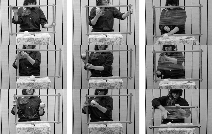
Actually can't use these photos because the warp is too thin- and I only discovered this after- when I tried to weave with t-shirt yarn on it. but still good explanation for people.
p.s. background and wardrobe all chosen very carefully. this was also a good test for camera angels.
Wednesday, 25 January 2012
William Morris at II Temple Place :: Unit 6 Visits.
 See big here.
William Morris is my favourite. So much depth. I spent all day there and did 15+ A4 drawings/notes.
Sunday, 15 January 2012
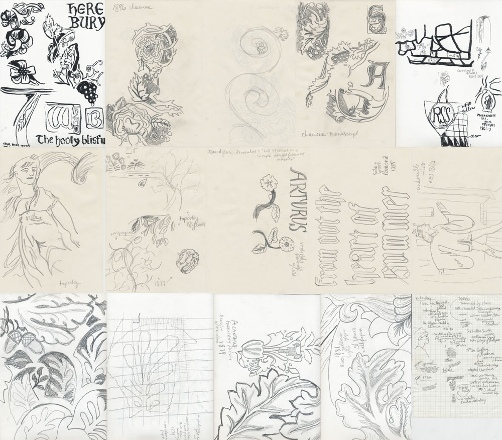
Explaining Weaving. :: FACT!
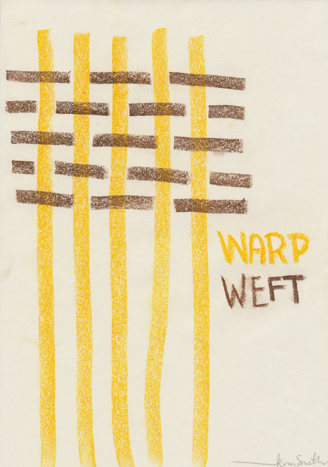 The above image was the first I did trying this out- and probably actually my favourite. Although- I think the curved lines in the weft are better to help explain. Some more pages from my sketchbook trying different things out:
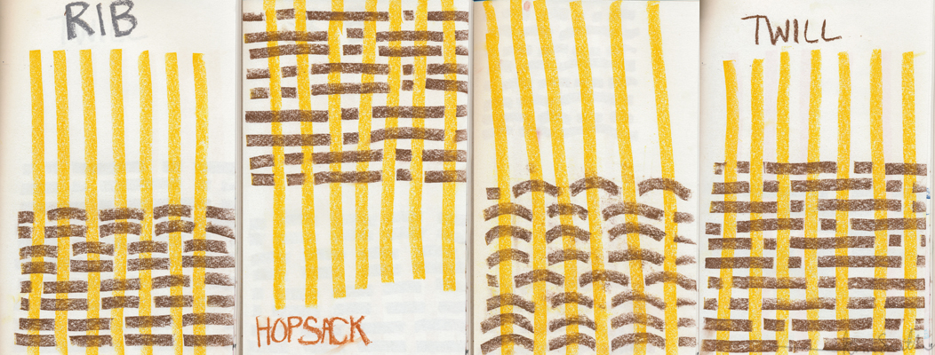 These are done in messy pastels. And it is getting everywhere and being annoying. I even hair-sprayed it. Must find a solution to this.
Thursday, 5 January 2012
Notes in Lectures :: Unit 5
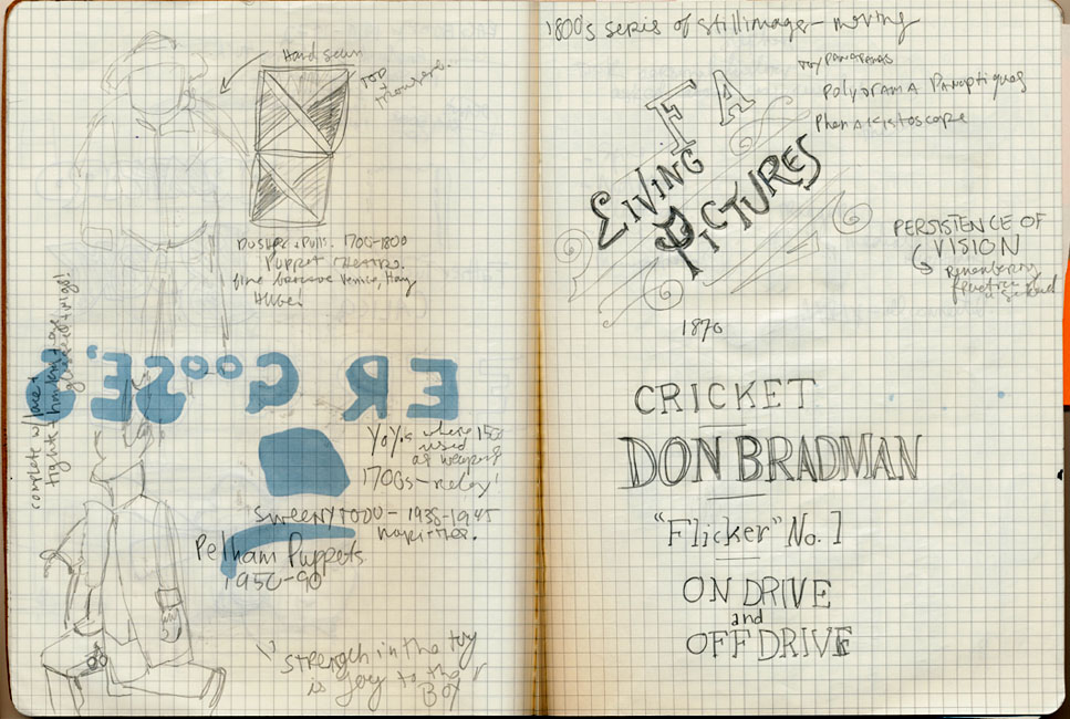
Last week, I shared with you some of my doodles of colourwork designs and patterns in my Summer 2011 notebook. In this notebook of mine, I also had a lot of doodles during lectures or talks that I went to. I have a nasty habit of drawing what people are wearing next to me (see the roses two pages down) or the room I'm in, or the lecturer. haha. They are mind triggers, and help me remember being there. Also, I'm a big believer in taking notes! I find I remember things better if I write them down. So anything that is relevant to me- key words, favourite phrases, and thoughts while I'm listening to a talk all go down in note-form. (Often accompained by arrows or boxes or other doodles!)


 Yup- I'm that girl at the front, jotting down notes like a regular Hermione! No shame in that!! :]
kimxo
**Copied from ArtEqualsHappy**
kimxo
**Copied from ArtEqualsHappy**
Wednesday, 30 November 2011
Museum Of Childhood. :: Unit 6 Visits.


I increased the contrast on these a little bit so you can see my pencil marks better. There are also more house drawings in my Vocab book.
Museum Of Childhood.
Photographs at Standen house :: Bluebeard!
Taken October 2011. Standen House.
Kimxo
**Copied from ArtEqualsHappy**
Tuesday, 22 November 2011
Drawing at Standen House :: Bluebeard!
Here are some of the quick drawings I did whilst I was there and from photos I took. I mainly wanted to focus on the house as a wealthy, mysterious and fantastical place. Full of entrancing patterns and objects- but that could be the scene for a more sinister story. At this stage I was purely gathering visual information.
(Photo at top taken by Mum on her iPhone.)
Love, Kimxo
Subscribe to:
Comments (Atom)