
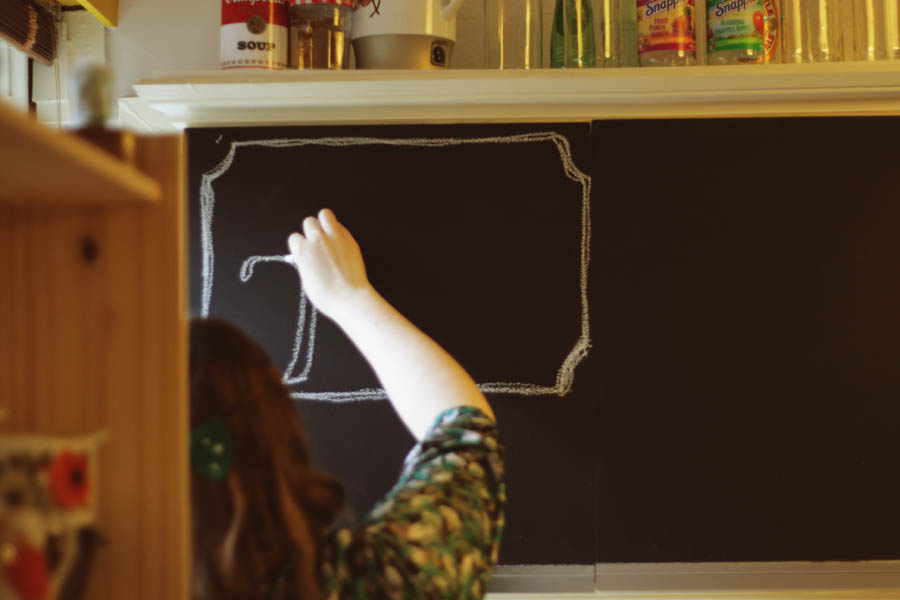
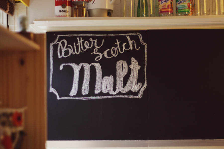
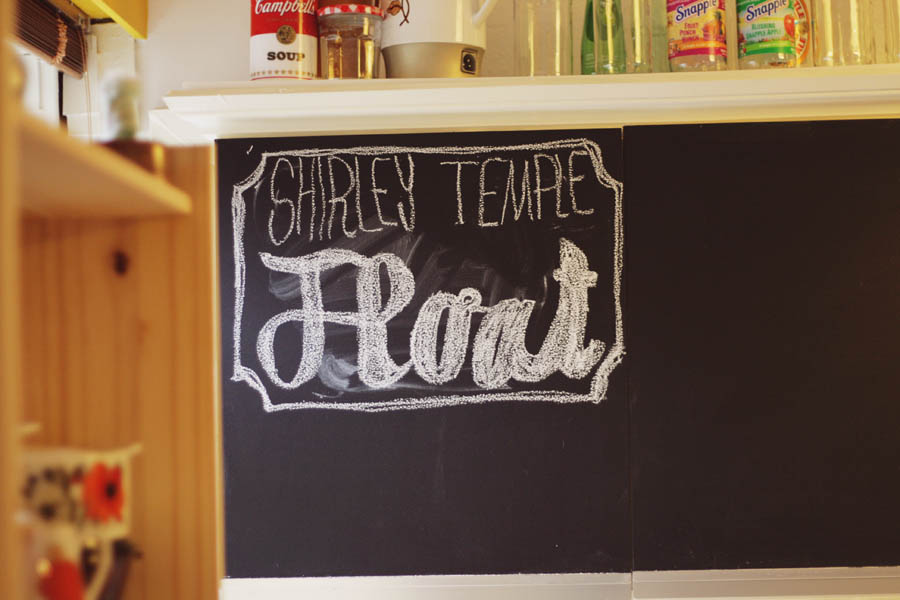
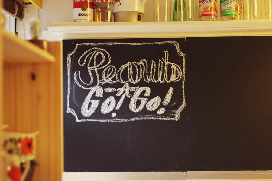
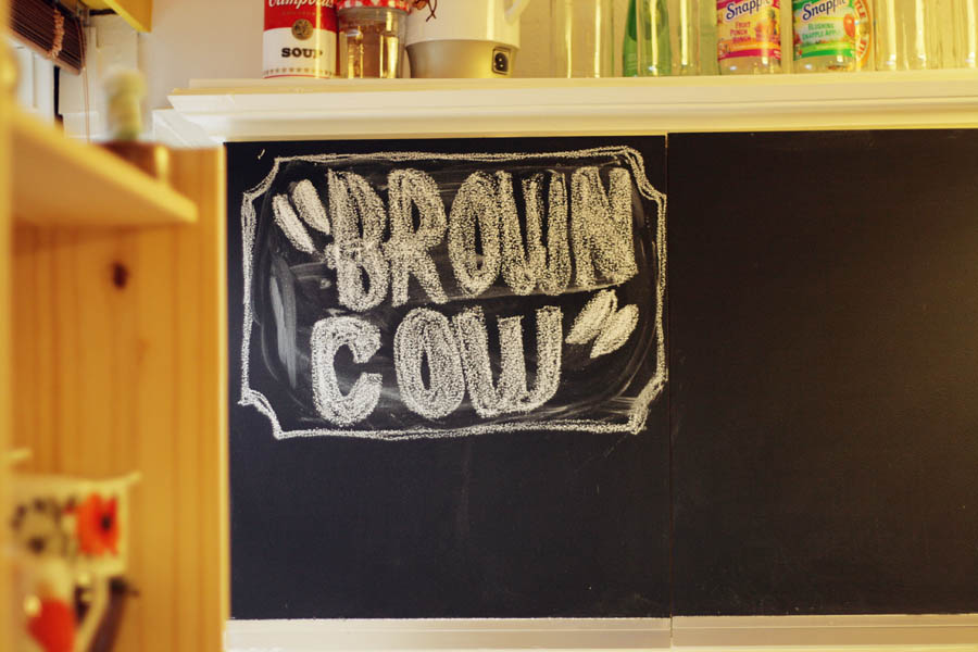
 Tomorrow is the deadline for our project which is an extension of the Chair project. Yesterday, out of desperation, I decided to go ahead and just see what would happen if I did the chalkboard animation. I needed something that I was confident with (I chose text, of course) and that I knew I could do in a couple of hours. Even so- with my health being all shaky, I had to go and lie down several times while doing this. It's just a bit ridiculous that I can't even stand up and draw on my chalkboard for more than 20 min. But- I did it. It was slow and painful, but I did it. (I'm not complaining- it's just important, i think, to document what happened.) Here are some images of each 'title':
There are several negative things I could say about it, BUT focusing on the positives here they are:
-a lot of thinking about 'atmosphere' meant that I wanted to include a little bit of my house or 'the space' in which i drew this. I decided to draw straight onto the cupboards, instead of having to paint new boards which wouldn't have saved me time or energy.
-one colour of chalk to keep it simple and to keep the pops of colour to the background- focusing your eyes on the drawings as the colour pieces would be out of focus and keep it from being coming boring.
-used my new lense which has an f-stop of 1.8 so that the focus could be very precise and i could do it in natural lighting.
-the actual text translated great onto chalkboard.
-thought of little transitions which would flow one into the next.
-drew the ingredients separately so i could borrow a slightly cheesy technique of overlay from some of the Elvis videos i've been watching.
-thought about black and white, but decided that the actual chalkboard looked much better when it was the only thing in black and white (see previous point about colour).
Overall, I think it looks good- it looks like it's just magically appearing on the board, like a fun interactive menu (showing you what's on offer and what's in it, and changing like flicking a channel). Plus I chose a song which is an 'oldie' and doesn't distract too much from what's going on.
When Vimeo decides to accept my video, I'll post it. [:
p.s. i think i will still produce the recipe cards with drawings of the musicians on the back (just digital prints)- as a supplement to this. maybe i should make a youtube playlist too, of my favourites- so in theory:
you watch the animation, you get inspired, you read how to make them and you listen to the songs while you enjoy a drink with your friends.
does that have a narrative? it's more of a 'make your own narrative'.
No comments:
Post a Comment